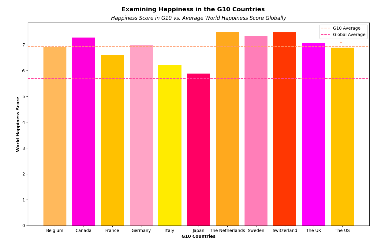
For my analysis, I explored the happiness scores of the G10 countries using Python and R. In Python, I utilized matplotlib and pandas to visualize the data, focusing on the G10 countries' happiness scores compared to the global average. After preprocessing the dataset to include only relevant columns and G10 countries, I calculated the average happiness score for the G10 nations and the global average.
The resulting bar graph vividly showcased each G10 country's happiness score, with distinctive colors for visual appeal. Additionally, I used R to conduct a one-sample t-test comparing the G10 countries' happiness scores to the global average. The t-test yielded a significant result (t = 9.8007, p-value = 1.911e-06), suggesting that the G10 countries' happiness scores significantly differed from the global average. Specifically, the G10 countries had a mean happiness score of 6.92, significantly higher than the global average of 5.41.
This analysis underscores the relatively higher happiness levels within the G10 countries compared to the global average, emphasizing the importance of further exploration into the factors contributing to this disparity.
Data Analysis
Python was utilized to generate the plot. Click the button below to unveil the Python code.
import matplotlib.pyplot as plt
import pandas as pd
import numpy as np
import random
# Load data
dataframe = pd.read_csv('./data/WHR_2019_Full.csv')
dataframe = dataframe.dropna(subset=['Overall rank', 'Continent', 'Country or region', 'Score', 'GDP per capita', 'Social support',
'Healthy life expectancy', 'Freedom to make life choices', 'Generosity', 'Perceptions of corruption',
'Gini index'])
overall = dataframe['Overall rank'].values
continent = dataframe['Continent'].values
country = dataframe['Country or region'].values
score = dataframe['Score'].values
gdp = dataframe['GDP per capita'].values
social = dataframe['Social support'].values
lifestyle = dataframe['Healthy life expectancy'].values
freedom = dataframe['Freedom to make life choices'].values
generosity = dataframe['Generosity'].values
perception = dataframe['Perceptions of corruption'].values
gini = dataframe['Gini index'].values
# Create colour scheme
def random_colour():
r = 1
g = random.uniform(0, 1)
b = random.uniform(0, 1)
return (r, g, b)
colours = [random_colour() for _ in range(len(overall))]
# Rename Countries
dataframe['Country or region'] = dataframe['Country or region'].replace(
{'The United States': 'The US'}
)
dataframe['Country or region'] = dataframe['Country or region'].replace(
{'The United Kingdom': 'The UK'}
)
# Define G10 countries
g10_countries = ['The US', 'Japan', 'The Netherlands', 'The UK', 'France',
'Italy', 'Canada', 'Sweden', 'Germany', 'Belgium', 'Switzerland']
g10_data = dataframe[dataframe['Country or region'].isin(g10_countries)]
# Plot Data
plt.bar(x=g10_data['Country or region'], height=g10_data['Score'], color=colours)
plt.xlabel('G10 Countries', fontweight='bold')
plt.ylabel('World Happiness Score', fontweight='bold')
plt.suptitle(r'Examining Happiness in the G10 Countries', fontsize=14, fontweight='bold', y=0.94)
plt.title(r'Happiness Score in G10 vs. Average World Happiness Score Globally', fontsize=12, fontstyle='italic')
R was utilized to generate the statistical analysis. Click the button below to unveil the R code.
            > data <- read.csv("~/Desktop/Data Analyst/Git/world-happiness-analysis/data/WHR_2019_Full.csv")

            > g10_countries <- c("The United States", "Japan", "The Netherlands", "The United Kingdom", "France", "Italy", "Canada", "Sweden", "Germany", "Belgium", "Switzerland")

            > global_avg <- mean(data$Score)

            > g10_data <- subset(data, Country.or.region %in% g10_countries)

            > t_test_result <- t.test(g10_data$Score, mu = global_avg)

            > print(t_test_result)


              One Sample t-test


            data:  g10_data$Score

            t = 9.8007, df = 10, p-value = 1.911e-06

            alternative hypothesis: true mean is not equal to 5.407096

            95 percent confidence interval:

             6.577734 7.266630

            sample estimates:

            mean of x

             6.922182