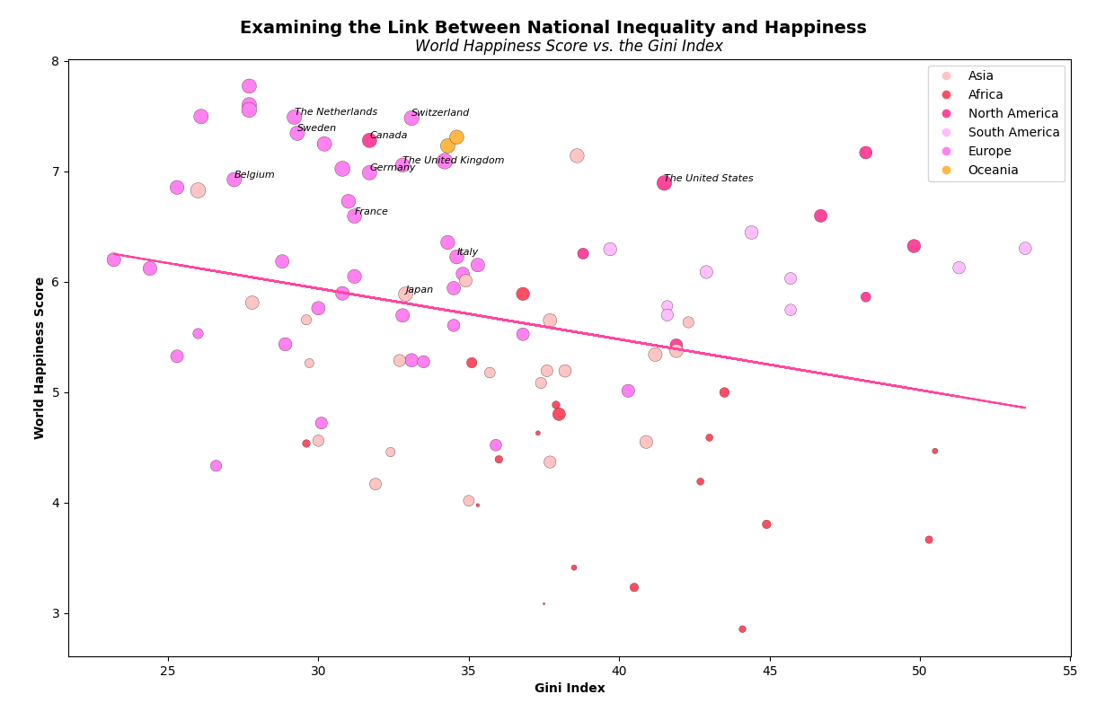
For my second analysis, I conducted a regression analysis using Python and R to investigate the relationship between the World Happiness Score (WHS) and the Gini Index, a measure of income inequality. Additionally, I incorporated GDP per capita as a variable to adjust the size of the data points in the scatter plot, providing insights into how GDP might influence WHS. The Python code utilized matplotlib and pandas to visualize the data, where larger circles represented higher GDP values, and distinct colors were assigned to each continent for easy identification.
The regression analysis in Python generated a regression line, indicating an inverse relationship between WHS and the Gini Index, with countries having lower Gini Index scores associated with higher WHS. Moreover, using R, I ran a linear regression model which yielded significant results (p-value = 0.00473), confirming the inverse relationship between WHS and the Gini Index. The regression coefficients indicated that, on average, for every one-unit increase in the Gini Index, WHS decreased by approximately 0.04699 points.
This analysis underscores the importance of economic equality in fostering overall happiness within nations and highlights the potential impact of income distribution on societal well-being.
Data Analysis
Python was utilized to generate the plot. Click the button below to unveil the Python code.
import matplotlib.pyplot as plt
import pandas as pd
import numpy as np
import random
import csv
# Load data
dataframe = pd.read_csv('./data/WHR_2019_Full.csv')
dataframe = dataframe.dropna(subset=['Overall rank', 'Continent', 'Country or region', 'Score', 'GDP per capita', 'Social support',
'Healthy life expectancy', 'Freedom to make life choices', 'Generosity', 'Perceptions of corruption',
'Gini index'])
overall = dataframe['Overall rank'].values
continent = dataframe['Continent'].values
country = dataframe['Country or region'].values
score = dataframe['Score'].values
gdp = dataframe['GDP per capita'].values
social = dataframe['Social support'].values
lifestyle = dataframe['Healthy life expectancy'].values
freedom = dataframe['Freedom to make life choices'].values
generosity = dataframe['Generosity'].values
perception = dataframe['Perceptions of corruption'].values
gini = dataframe['Gini index'].values
# Fit with polyfit
b, m = np.polyfit(gini, score, 1)
# Create the regression line
line = -0.04699 * gini + 7.38486
# Define G10 countries
g10_countries = ['The United States', 'Japan', 'The Netherlands', 'The United Kingdom', 'France',
'Italy', 'Canada', 'Sweden', 'Germany', 'Belgium', 'Switzerland']
# Plot Data
plt.scatter(x='x', y='y', c=colours, s='s', edgecolors='black', linewidths=0.2, data=data)
for i, txt in enumerate(country):
if txt in g10_countries:
plt.text(gini[i], score[i], txt, fontsize=8, fontstyle='italic', ha='left', va='bottom')
plt.plot(gini, line, '-', c=(1, 0.3847458156188478, 0.63663287647886184))
plt.xlabel('Gini Index', fontweight='bold')
plt.ylabel('World Happiness Score', fontweight='bold')
plt.suptitle(r'Examining the Link Between National Inequality and Happiness', fontsize=14, fontweight='bold', y=0.93)
plt.title(r'World Happiness Score vs. the Gini Index', fontsize=12, fontstyle='italic')
Residual standard error: 1.091 on 96 degrees of freedom
(58 observations deleted due to missingness)
Multiple R-squared: 0.08017, Adjusted R-squared: 0.07059
F-statistic: 8.367 on 1 and 96 DF, p-value: 0.004727